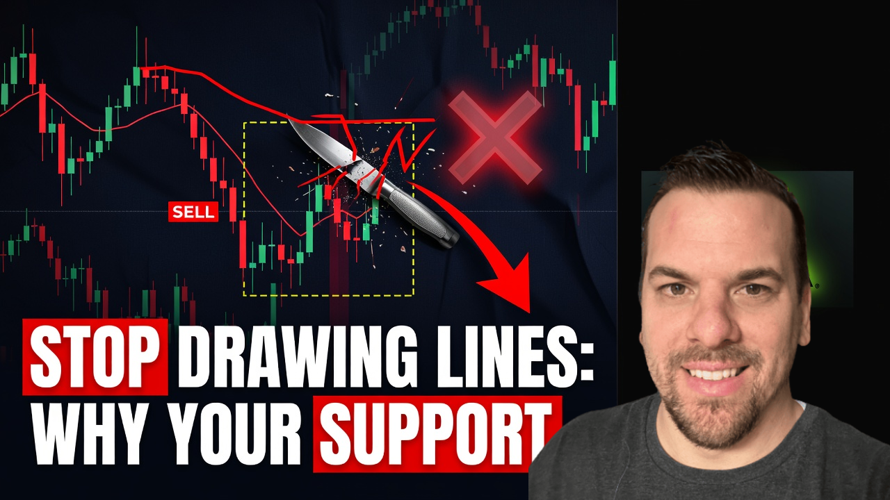
Stop Drawing Lines: Why Your Support and Resistance Levels Are Wrong

📊 July 14, 2026
- Support and resistance are not exact price coordinates; they are dynamic zones of order flow.
- The single biggest flaw with the common approach is drawing single, razor-thin lines that get constantly hunted and breached by market makers.
- What to do instead is plot wider, high-volume zones based on order blocks and previous consolidated structures.
— Ben, Find Better Trades
Every single day, I see retail traders post charts covered in a chaotic spiderweb of thin, colorful horizontal lines. They treat these lines like impenetrable steel walls, expecting price to bounce off them to the exact penny. It is a delusion that does nothing but feed liquidity directly to institutional algorithms.
The market does not care about your single-pixel line drawn from a random wick three weeks ago. If you continue to trade support and resistance as rigid price points, you will keep getting stopped out right before the market moves in your direction.
Why Everyone Gets This Wrong
The conventional wisdom taught in basic trading books tells you to connect the exact tops of wicks and call it resistance. This lazy approach assumes that thousands of buyers and sellers will magically agree on an identical, exact price point down to the decimal. In reality, the market is a highly fluid auction process driven by shifting order flow, not a mathematical equation.
When you draw a single line, you fall into the trap of the stop-run. Imagine a stock trading up to a clear resistance line at exactly fifty dollars, where retail traders have placed their short entries and set their tight stop-losses at fifty dollars and fifty cents. Smart money knows those orders are sitting there waiting to be triggered.
The institutional algorithms will deliberately push price past your line to grab that pool of liquidity, triggering your buy-stops before aggressively reversing the trend downward. You get stopped out for a loss, only to watch the price immediately dump exactly as you originally predicted.
What Actually Works
To stop getting hunted, you must stop drawing lines and start plotting liquidity zones. A true area of support or resistance is a horizontal band of price where a high volume of orders was previously exchanged, leaving behind unfinished business. I look for consolidated ranges where price spent significant time before making a violent, directional breakout.
To draw these zones correctly, find the body closes of the candles at a turning point rather than just the extreme wick tips. Draw a shaded rectangle that spans from the highest candle body close to the absolute highest wick tip for a resistance zone, and do the opposite for a support zone.
By treating these areas as zones, you force yourself to wait for price to penetrate deep into the area before looking for an entry. This simple shift in perspective allows you to hunt for confirmation signs, like a rapid rejection candle, rather than blindly placing limit orders on a fragile line.
When the Old Way Can Still Help
The only time a single, precise line has any real utility is when you are defining your absolute invalidation level. While your entry should always be executed within a wider zone, your stop-loss must be placed safely outside the entire structure. A clean break of the zone boundaries tells you your trade thesis is completely dead.
Using a single line as a hard boundary for risk management, rather than an aggressive trigger for entry, keeps you from taking unnecessary losses. It turns a retail weakness into a systematic strength by keeping your risk-to-reward ratio highly skewed in your favor.
Frequently Asked Questions About Support and Resistance Zones
Q: How wide should my support and resistance zones be?
A: Your zones should encompass the entire consolidation range of the candle bodies and wicks at previous turning points, typically representing one to two percent of the asset’s average true range on your trading timeframe.
Q: Do support and resistance zones work on all timeframes?
A: Yes, but higher timeframes like the daily and four-hour charts hold significantly more volume and order flow memory, making them far more reliable than highly volatile five-minute charts.
🎯 Get High-Probability Trade Setups — Free
The Big Dipper Dashboard delivers curated trade ideas straight to your screen every morning. Know what to watch before the opening bell.

📈 Want More? Join Our Free Trading Community
- Trading Strategy Guides Telegram — daily strategy tips and market insights
- Find Better Trades Telegram — free trade signals delivered to your phone
- Find Better Trades on YouTube — live trade breakdowns and tutorials