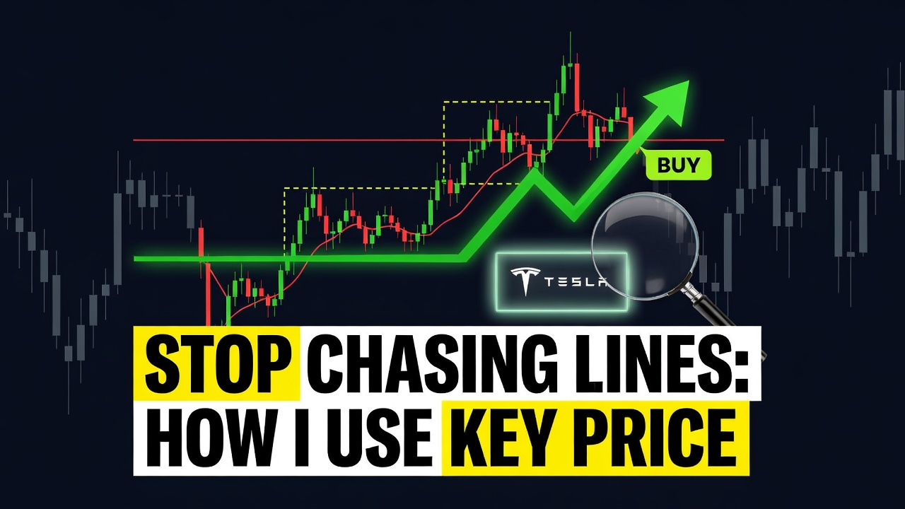
Stop Chasing Lines: How I Use Key Price Levels to Time Every Trade

📊 July 14, 2026
- Single price lines are a retail trap designed to stop you out right before the real move occurs.
- Most traders draw dozens of exact support and resistance lines on their charts, leading to analysis paralysis and constant premature entries.
- Treat key levels as fluid, high-volume zones and wait for institutional rejection before putting your capital at risk.
— Ben, Find Better Trades
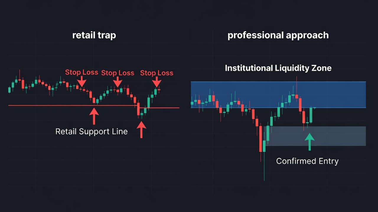
Retail traders love drawing thin, exact lines on their charts and pretending the market is a perfect math equation. They treat a single price point like a brick wall, buying the exact millisecond price touches it, only to watch the market sweep their stop loss by five pips and reverse exactly where they wanted. If you want to survive in this game, you must stop trading lines and start trading zones of high-volume transaction history.
Why Everyone Gets This Wrong
The conventional wisdom teaches you to connect the swing highs and swing lows with a microscopic pencil tool on your charting software. You end up with a chart that looks like a spiderweb, convinced that 1.2050 is a magical barrier. The reality is that institutions do not care about your exact line; they care about liquidity pools, and those pools are wide and messy.
Imagine a market where price is aggressively driving downward toward a major support level. Retail traders place their buy limit orders exactly on that support line, putting their stop losses just a few ticks below it. Market makers see this massive cluster of stop-loss orders as a giant pool of liquidity they need to execute their own large buy orders.
The market predictably pierces right through your perfect line, triggers your stops, fills the institutional orders, and immediately rockets back upward. You got the direction right, but you got stopped out because you treated support as a line instead of a dynamic area of high-volume interest.
What Actually Works
To fix this, throw away the single-line drawing tool and start using rectangle tools to draw broad zones of interest. A real key level is a range of price where heavy buying or selling occurred in the recent past, usually spanning a width of 10 to 50 pips depending on your timeframe. I only draw these zones on the daily and four-hour charts to filter out the intraday noise.
Once price enters my designated zone, I do not blindly enter a trade. I wait for the market to prove that the zone is holding by looking for a specific price action confirmation, like a sweeping pin-bar candle or an engulfing pattern on the hourly chart. This confirmation proves that the big players have stepped in and are absorbing the opposing volume.
By waiting for price to sweep the outer boundary of your zone and then close back inside it, you let the market do the messy work of clearing out the weak hands first. Your entry becomes much safer, and you can place your stop loss comfortably outside the entire zone rather than right beneath a vulnerable, obvious line.
When the Line Can Still Help
There is only one scenario where a single, precise price line actually serves a purpose on my charts. I use exact daily or weekly highs and lows as absolute invalidation points for my trade ideas, rather than entries. If a daily candle closes entirely beyond the outer wick of a key zone, the level is officially broken, and I immediately cut my bias.
Using single lines purely to define when you are dead wrong, rather than where you should get in, keeps you on the right side of the trend. It shifts your focus from trying to predict the exact turning point to managing your risk objectively when a level fails.
🎯 Want Setups Like These? The Big Dipper Does the Scanning For You.
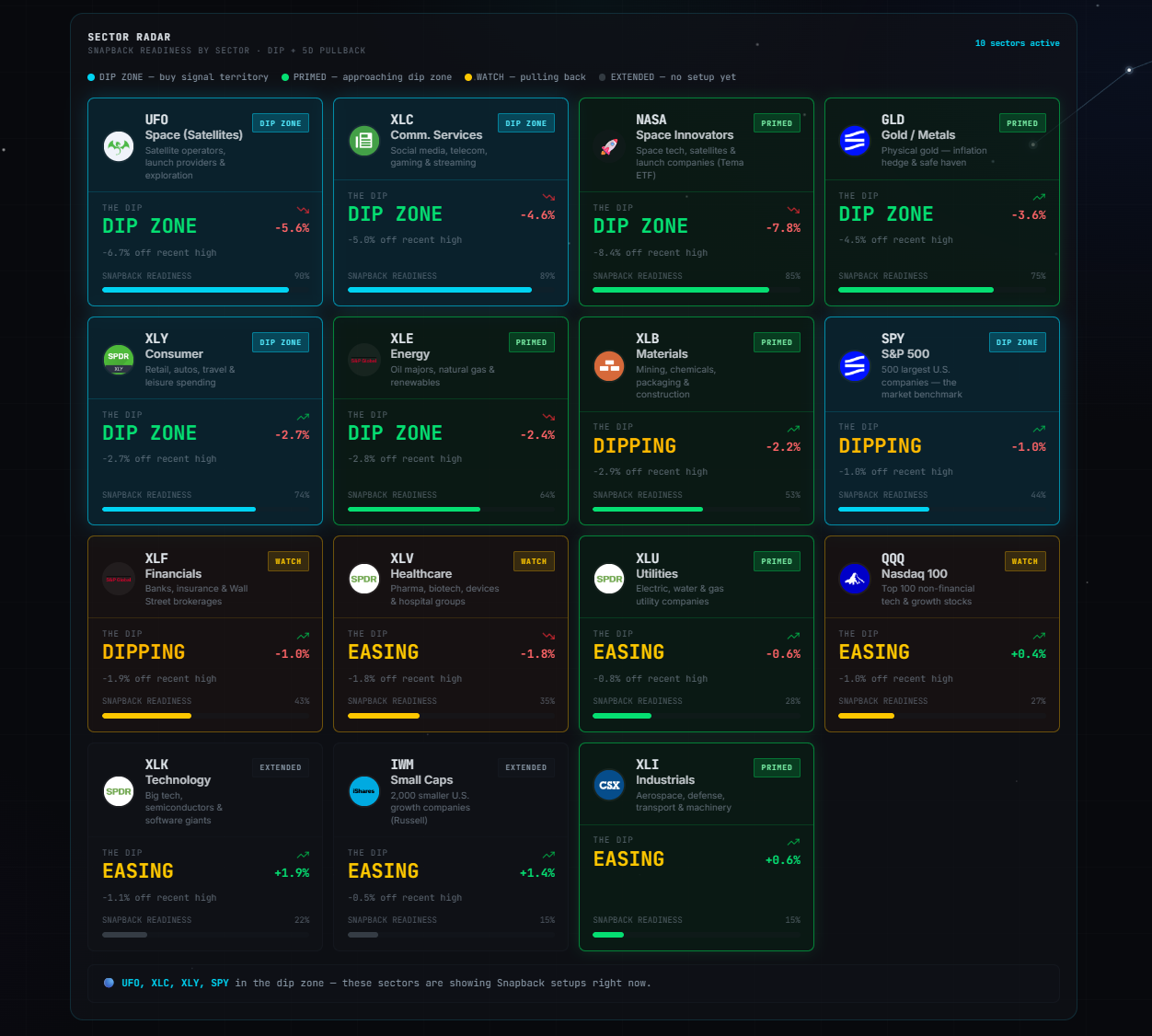
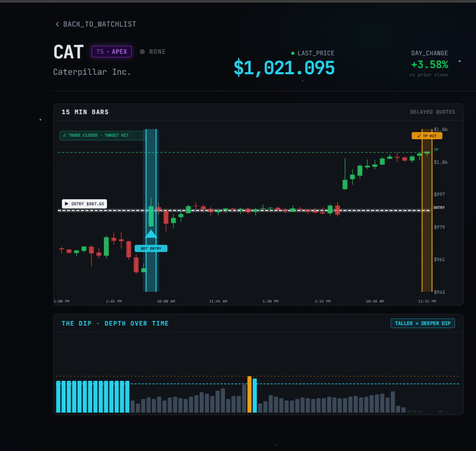
Every morning the Big Dipper delivers curated DIP ZONE trade ideas — stocks already at high-probability entry levels, with targets pre-set. No guessing, no scanning. Just setups.
Frequently Asked Questions About Price Levels
Q: How wide should my support or resistance zones be on my charts?
A: Your zones should encompass the entire consolidation cluster and the wicks of the previous swing highs or lows, which typically spans 15 to 40 pips on a four-hour chart.
Q: Do key price levels work better on lower timeframes like the 5-minute chart?
A: No, lower timeframes are filled with market noise and algorithms sweeping liquidity, making price zones highly unreliable compared to daily or four-hour key levels.
🎯 Get High-Probability Trade Setups — Free
The Big Dipper Dashboard delivers curated trade ideas straight to your screen every morning. Know what to watch before the opening bell.

📈 Want More? Join Our Free Trading Community
- Trading Strategy Guides Telegram — daily strategy tips and market insights
- Find Better Trades Telegram — free trade signals delivered to your phone
- Find Better Trades on YouTube — live trade breakdowns and tutorials